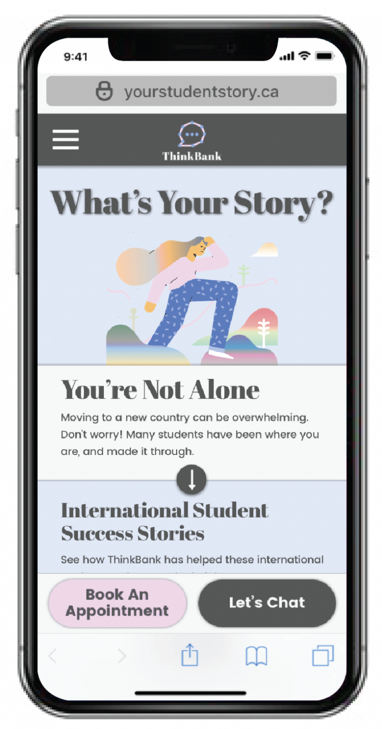
BMO Financial Group X BrainStation
4 Days Design Sprint Challenge
Goal: To create a microsite that offers a welcoming experience for newcomers
Being to establish a long-term trusting relationship between international students and ThinkBank
Our Design Sprint Project Goal
TIMELINE
4 Days Design Sprint
MY ROLE
UX Research, UX Design, Wireframes Maker, Stitcher
CLIENTS
ThinkBank by BMO Financial Group
The Brief
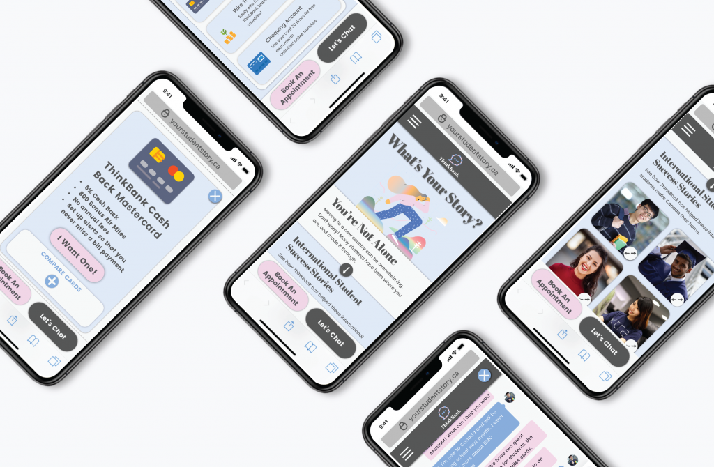
The interactive microsite was created during a week-long design sprint hosted by BrainStation and BMO Financial Group. We were given the design challenge of creating a web or mobile microsite design to help newcomers open a bank account for ‘ThinkBank’, a substitute brand given to us by the BMO Design team. We were provided with a set of personas to choose from as well as the branding guidelines (logo, font, icons, colour palette, subject illustrations). My team and I had 4 days to research, conduct user interviews, prototype, and complete usability testing with iterations.
Brand Guidelines
Colour Palette

Illustrations: Arginalia Artifficial Set

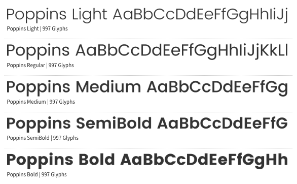
Typography: Poppins
Day 1 - Map
Start at the end, set a goal, interview users, Secondary Research
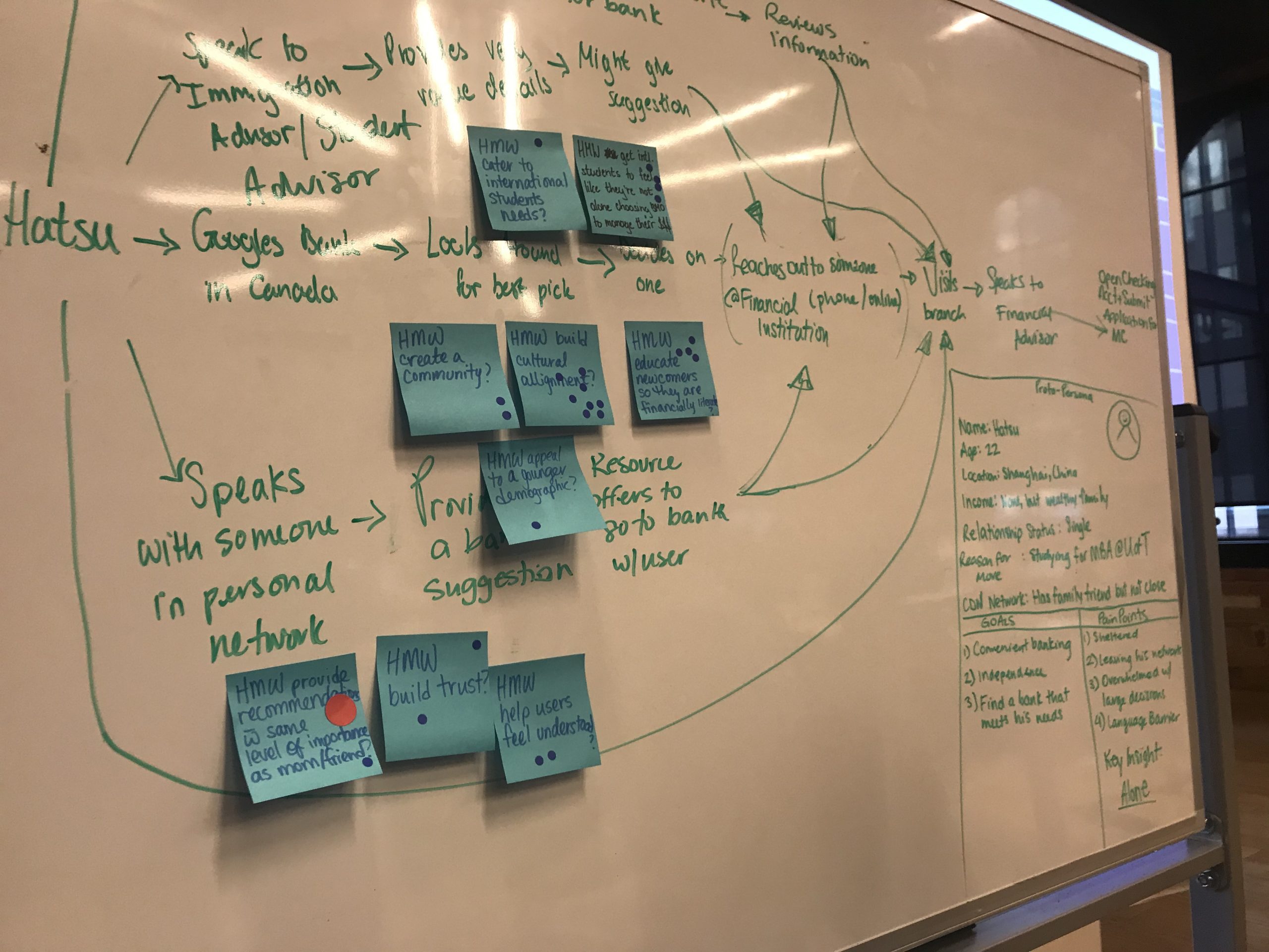
The Problem
Research Finding
- Canadian immigrants form a key market in the retail banking sector.
- 300,000 newcomers arrive in Canada each year, representing 22% of Canada’s population.
- There are zero partnerships between Canadian and foreign banks.
- The number of international students coming to Canada is increasing every year (250k in 2016/2017, 550k in 2018, 700k in 2019).
Talking to Real People
- Newcomers are looking for empathy in a financial advisor.
- They want to trust their bank.
- They want someone who speaks their language.
It is more convenient to use their phone for online banking. - They lack information about products and services.
Project Goal
Being to establish a long-term trusting relationship between international students and ThinkBank
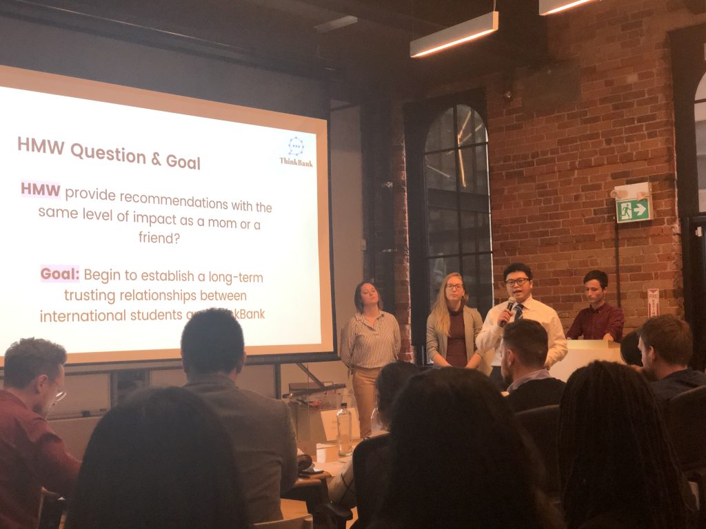
How Might We – Provide recommendations with the same level of impact as a mom or a friend?
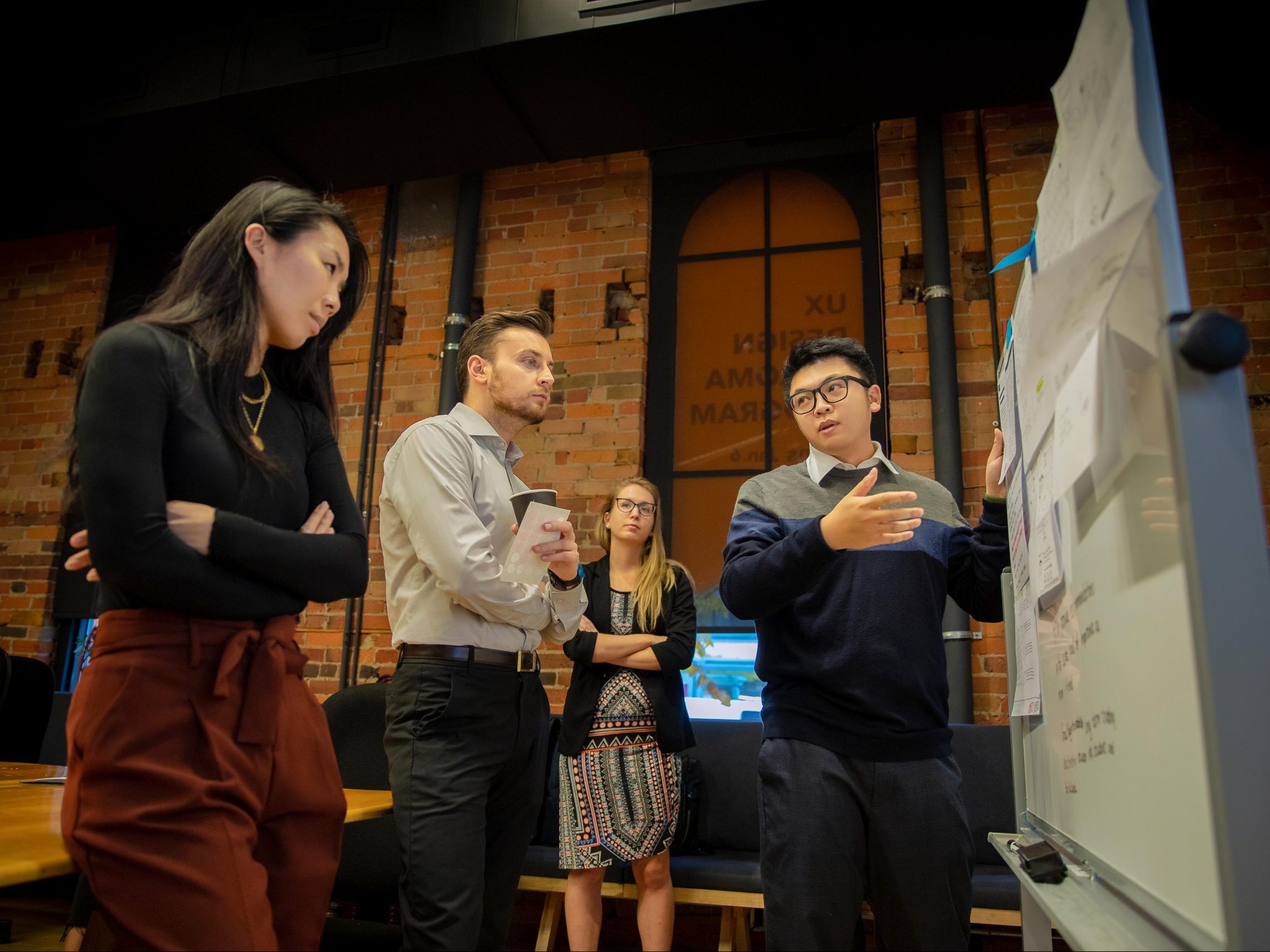
Day 2 - Sketch & Decide
Sketching, Ideation, Solution
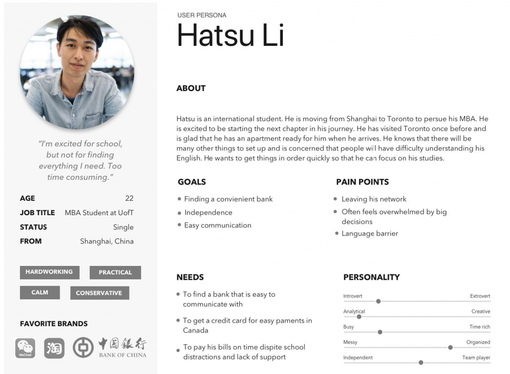
Persona - Hatsu Li
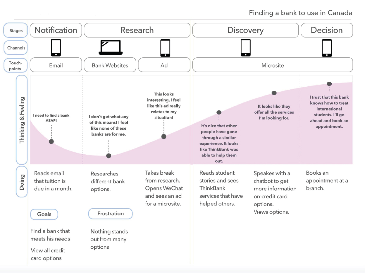
Our chosen persona is Hatsu Li, who arrived in Canada recently. He is looking to find financial information and assistance to open a banking account. He is not fluent in English and know nothing about banking in Canada. He want to get thing done so he can focus on his studies.
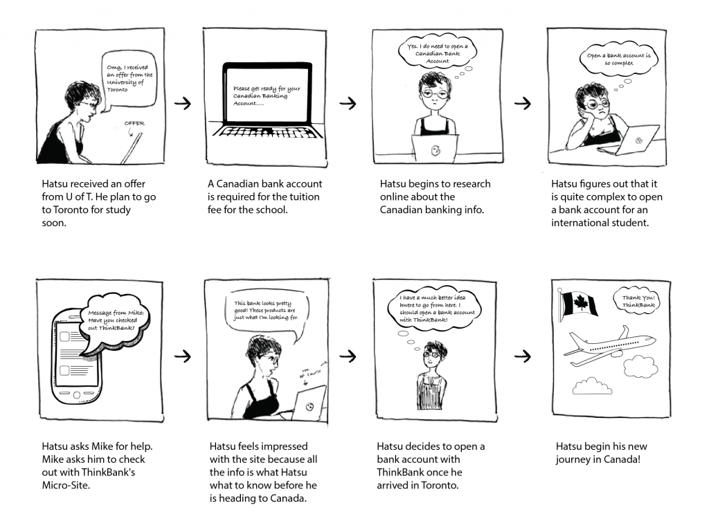
Storyboard
Experience Map
Solution
Day 3 - Prototype
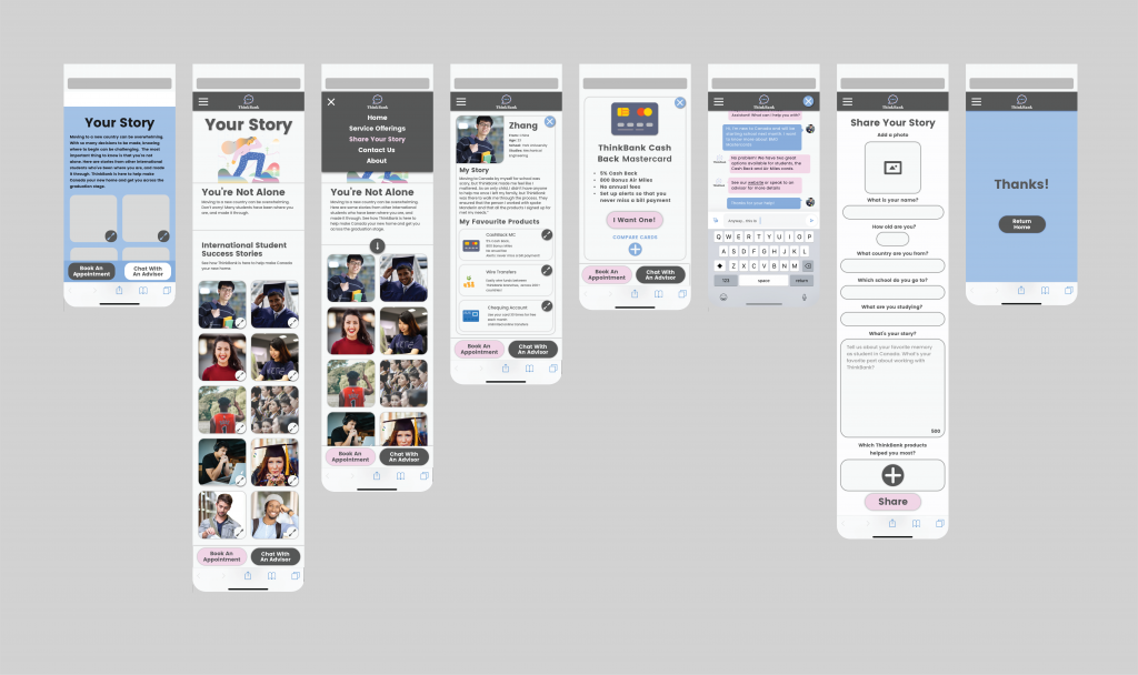
Build a Prototype

Initial Prototype
Day 4 - Test
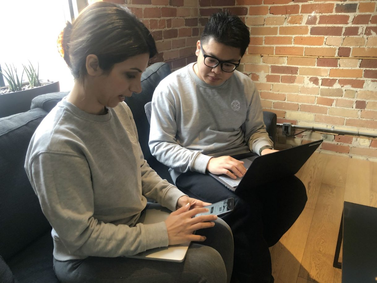
Test the Prototype and iteration
User Testing
Through user testing, we were able to verify that our prototype achieved majority of our initial sprint goals:
- Immediate sense of community: Users felt the sense of being in the international community, and they can’t wait to explore the site.
- User provided recommendations: Users understood from the strong walkthrough why they should choose ThinkBank product via other users’ recommendations.
It was apparent however, that there were minor issues to resolve to ensure usability:
- Language Selection: Some of the wording has a better choice. The tone of the phrasing should more like coming from the student perspective.
- Labelling and Font Size: For the interactive pages, some of the users found them to be unintuitive due to labelling or sizing of fonts.
Minor usability issues were quickly resolved to yield the final Hi-Fi prototype.
Final Prototype
Day 5 - Present
On the final day, we presented our design pitch to ThinkBank.

Reflection and Learning
Further Iterations: We would like to make further iteration of the core value that connects the user to the branch manager, and how to further shorten the emotional distance a newcomer has with big corporation banks.
Challenge: Our biggest challenge going into this was the time constraint and learning to work with each other to think fast on our feet. We were able to come together as a team and make decisions as one but also challenge ideas if needed. I would have loved to be able to test with more initial ideas and wireframes without the addition of colour and details. In my next steps, I would like to further test the next version to flush out possible usability issues.
