Tim Hortons iOS Redesign Challenge

This project was developed at BrainStation as part of the User Interface component of the course. Students required to conduct a practical heuristic evaluation of an existing digital product and create improved designs based on usability assessment and heuristic evaluation. All the improvement design should build upon consistency and current system standards.

Project Goals

  1. Improve Usability of the App
  2. Improve Transparency of the Order Progress of the App
  3. Improve App Preferment based on current Heuristics Evaluation

Project Length: 9 Days

Tool Used: Sketch and Illustrator

01. The Project Brief – Why Timmy

For this case study, I collaborated with two other designers to redesign an existing mobile app of our choice. Tim Hortons App is a mobile application for customer to order their food conveniently. They allow mobile payments and order on customers’ phones and avoid unnecessary waiting in the store. Our project goal was to redesign the user flow, user interface, and visual identity of the current Tim Hortons App to improve the overall user experience of the app.

02. Research Before the Sketches 

Before we did any Heuristics Evaluation or sketch, we decided to conduct user interviews and research to try to recognize the pain points with Tim’s current app. We interviewed several people who are daily using Tim’s App, and I’d like to share some of the common critiques that were mentioned:

  • The App is too confusing to use. Notably, it is challenging to let first-time users know what’s going to be expected of the process since there is no indication of flow. 
  • An outdated user interface can give the impression of the App or service being unreliable and unsupported to the user.
  • The rewards card system is not working well. 
  • Too many steps to order a coffee. 
  • No support/assistance if the user has any trouble while using the App.

02-1. Heuristic Evaluation

03. Current Design

Below addresses the pain points existing in current design. Some major problems on these screens include difficult and disorganized navigation, functional defect, and lack of hierarchy in information.

Home Page 

Order Page

Reload and Payment  

Add Credit Card 

04. Sketches

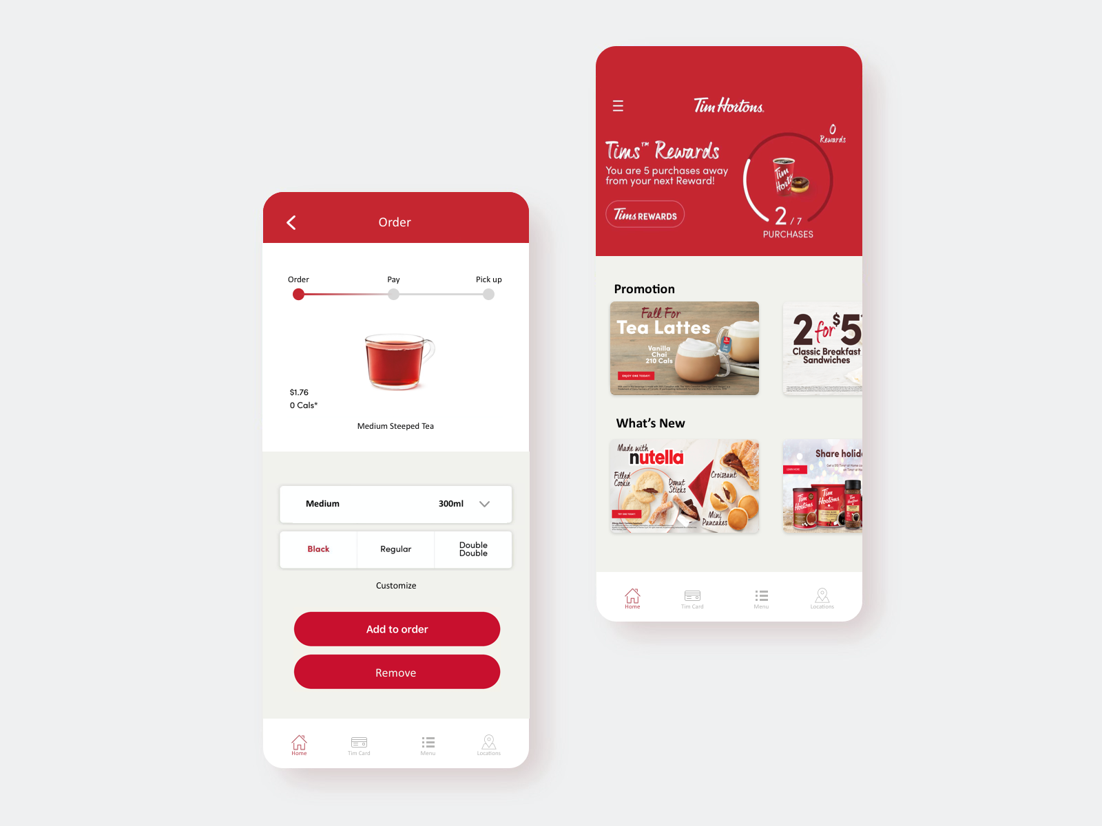
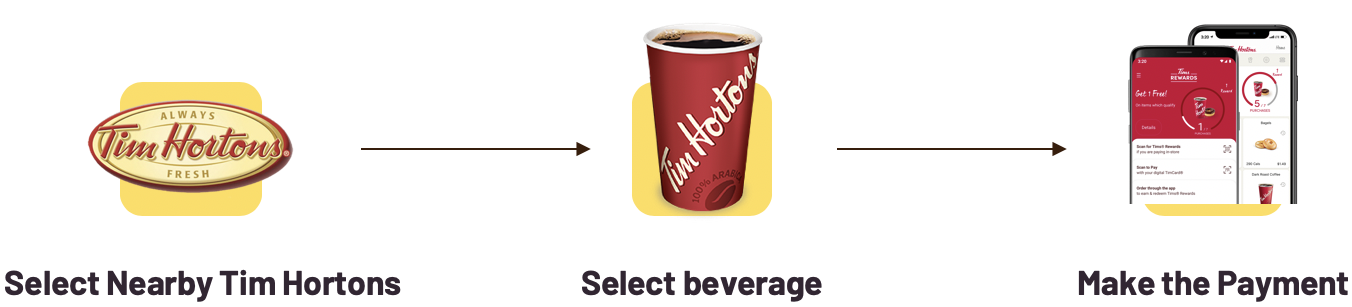
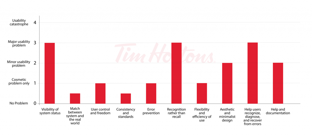
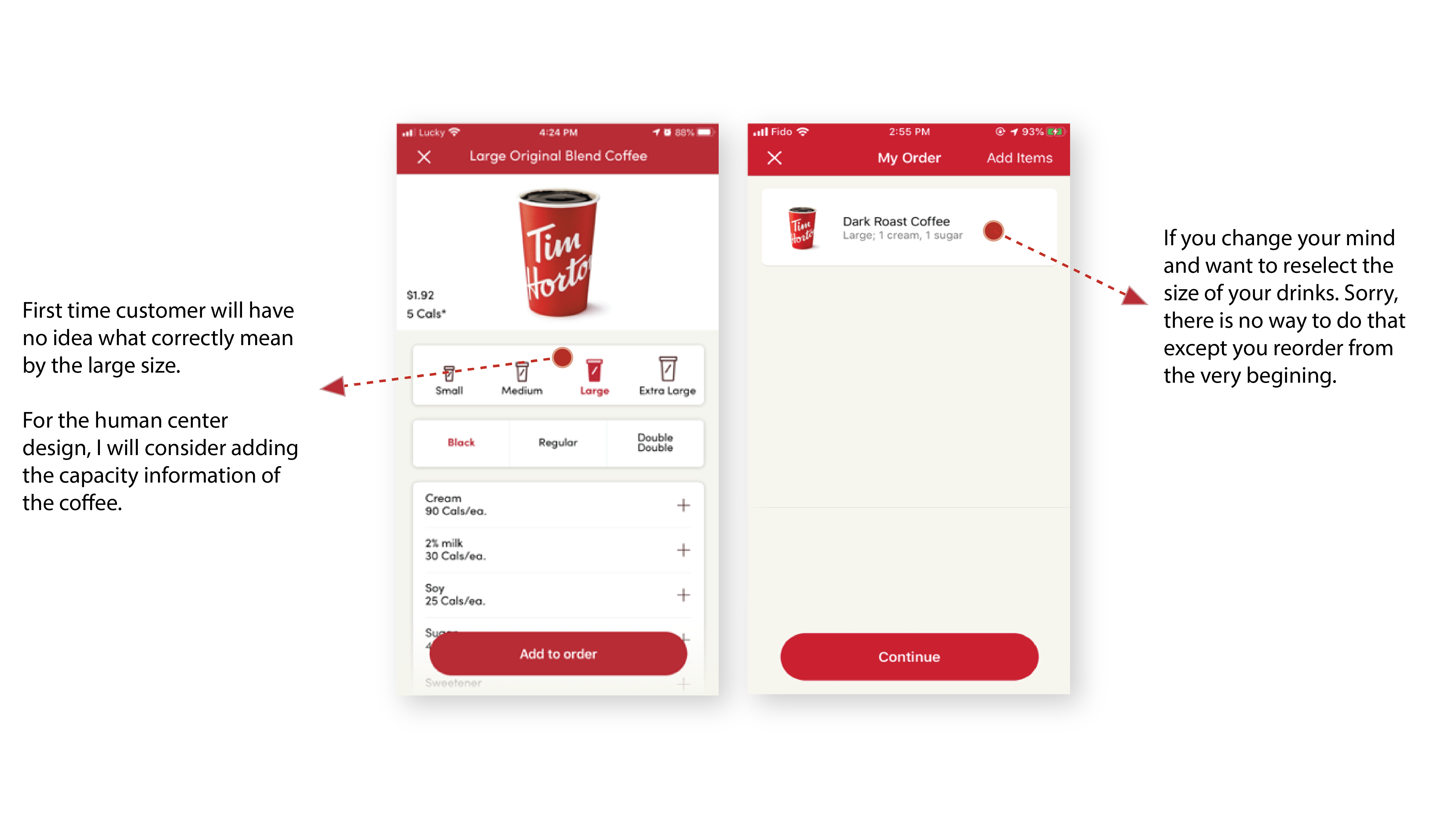
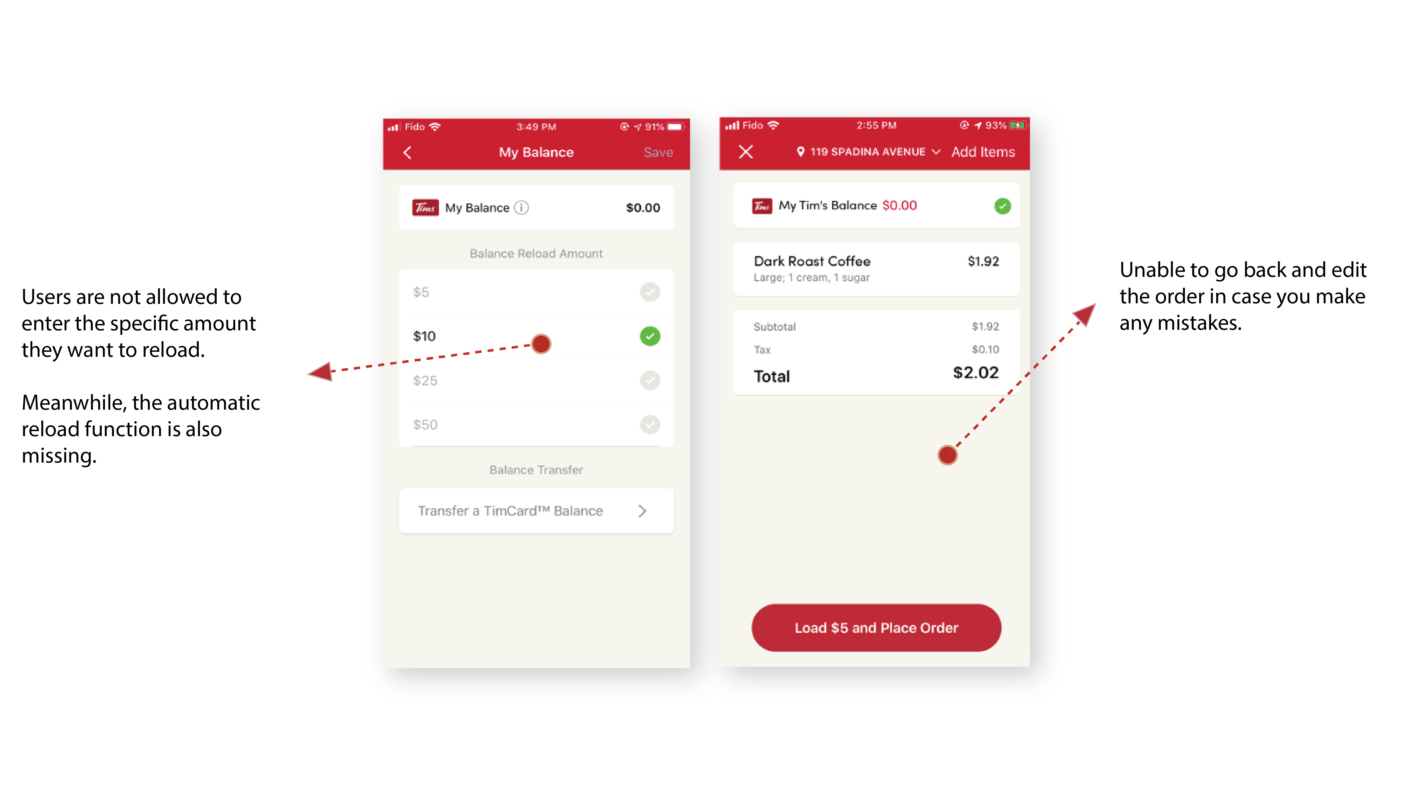
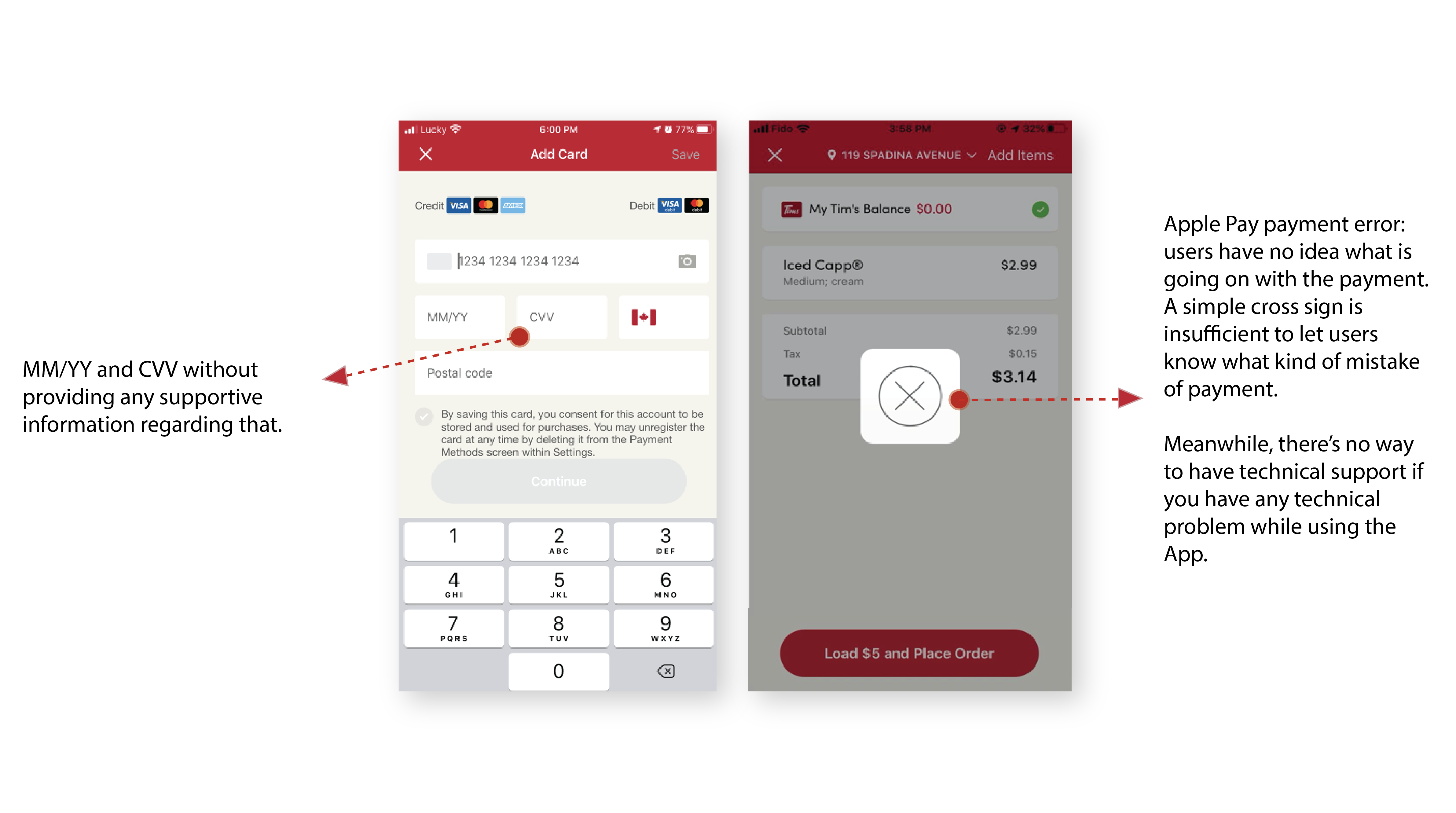
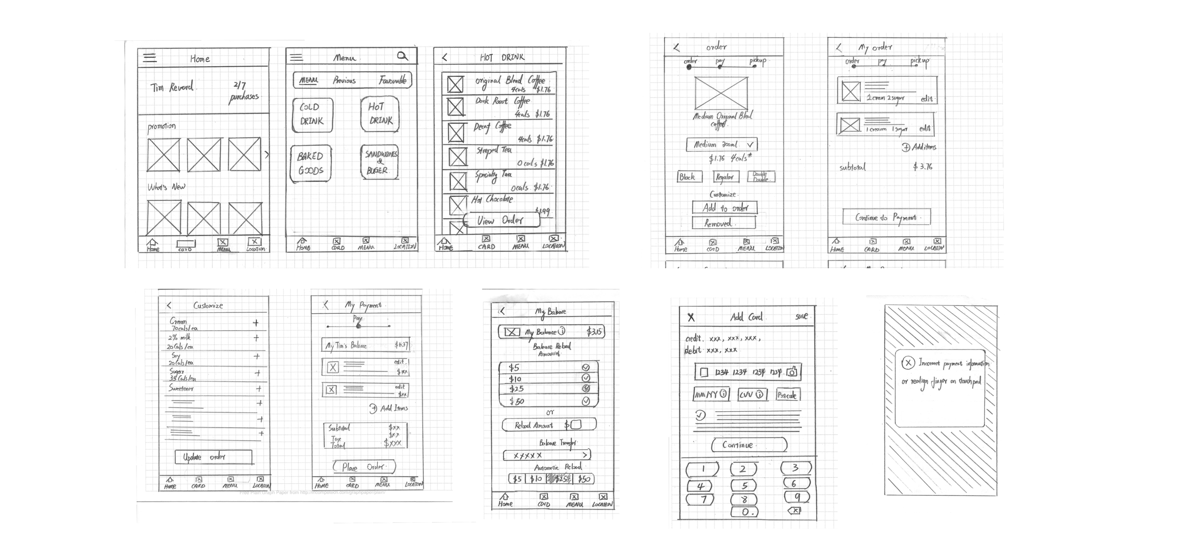
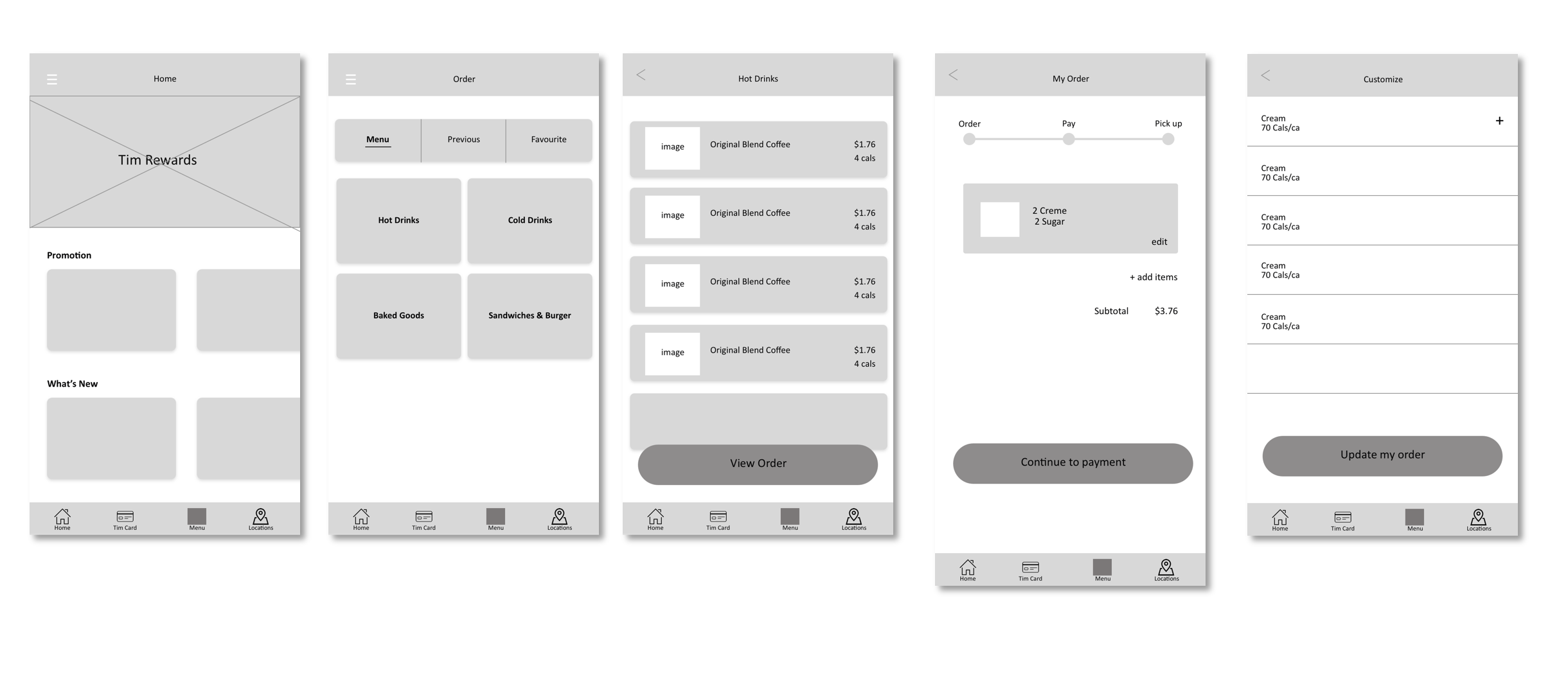
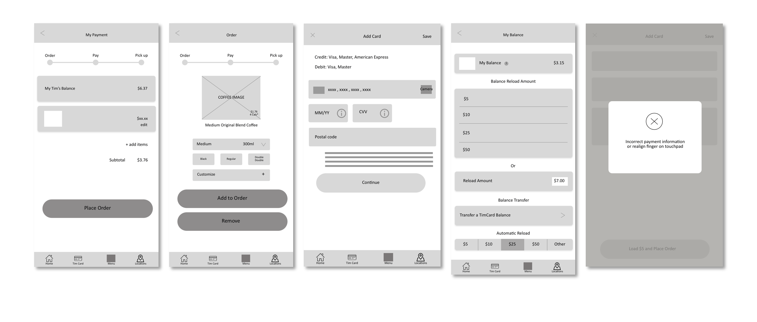
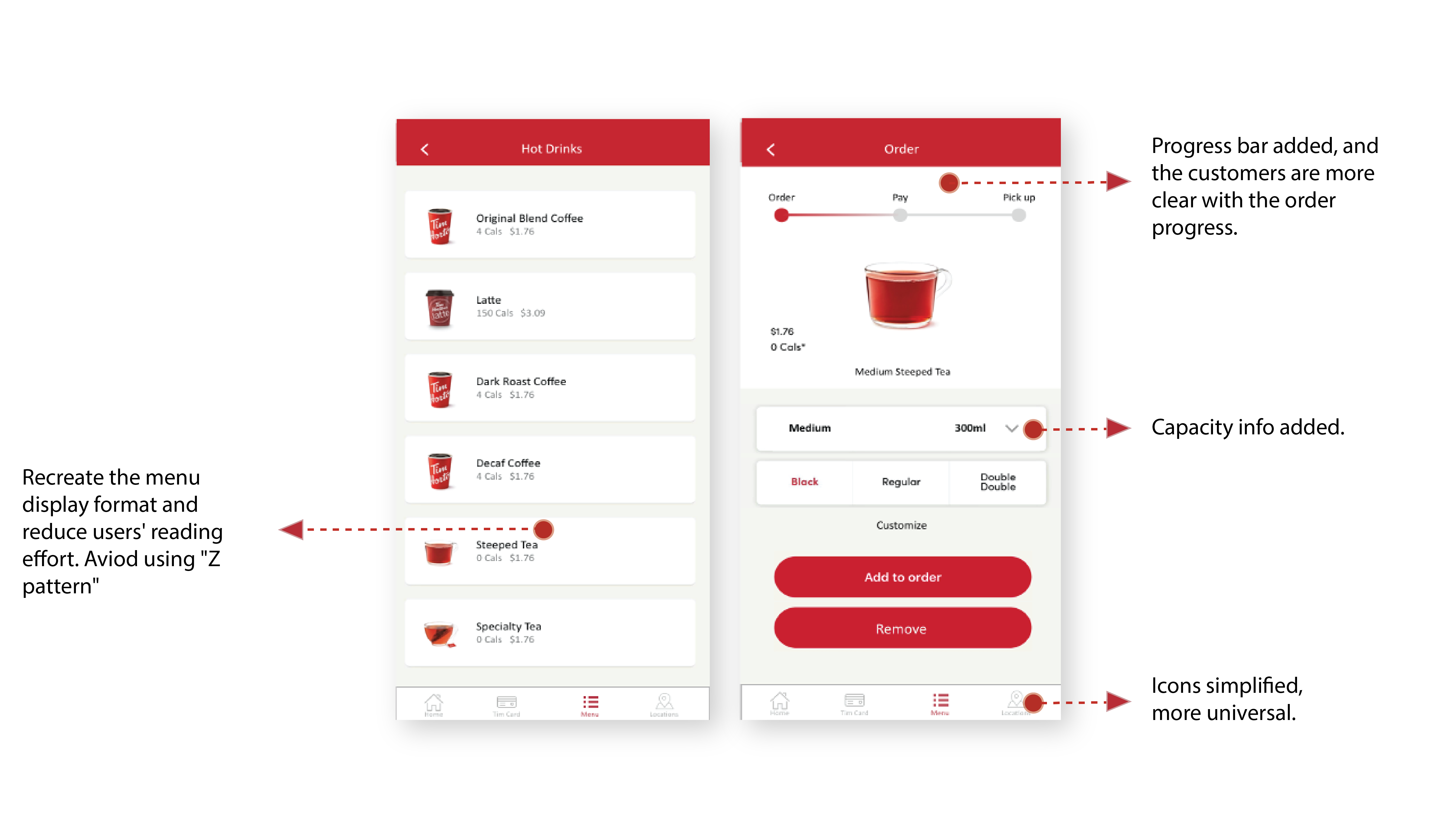
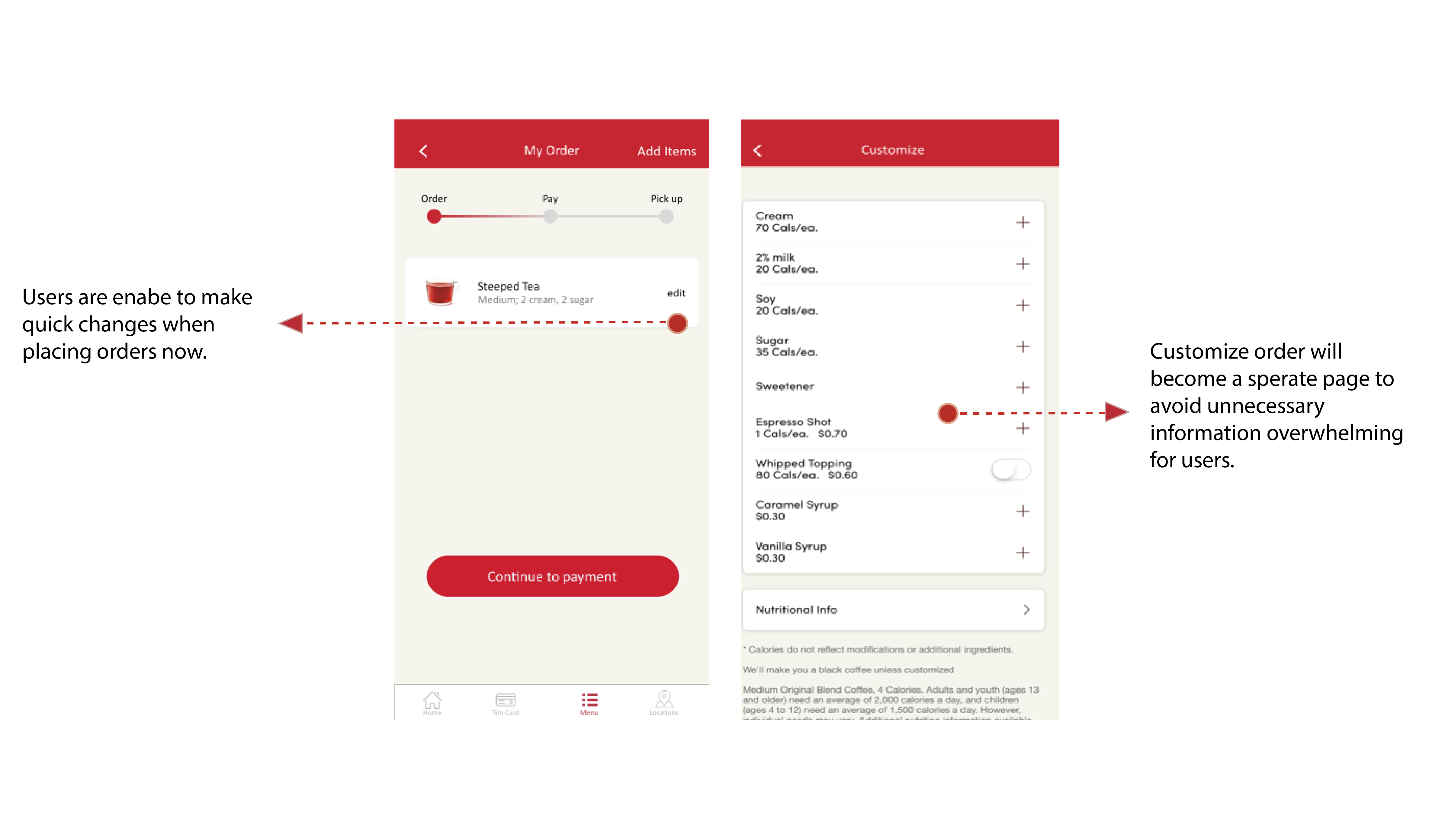
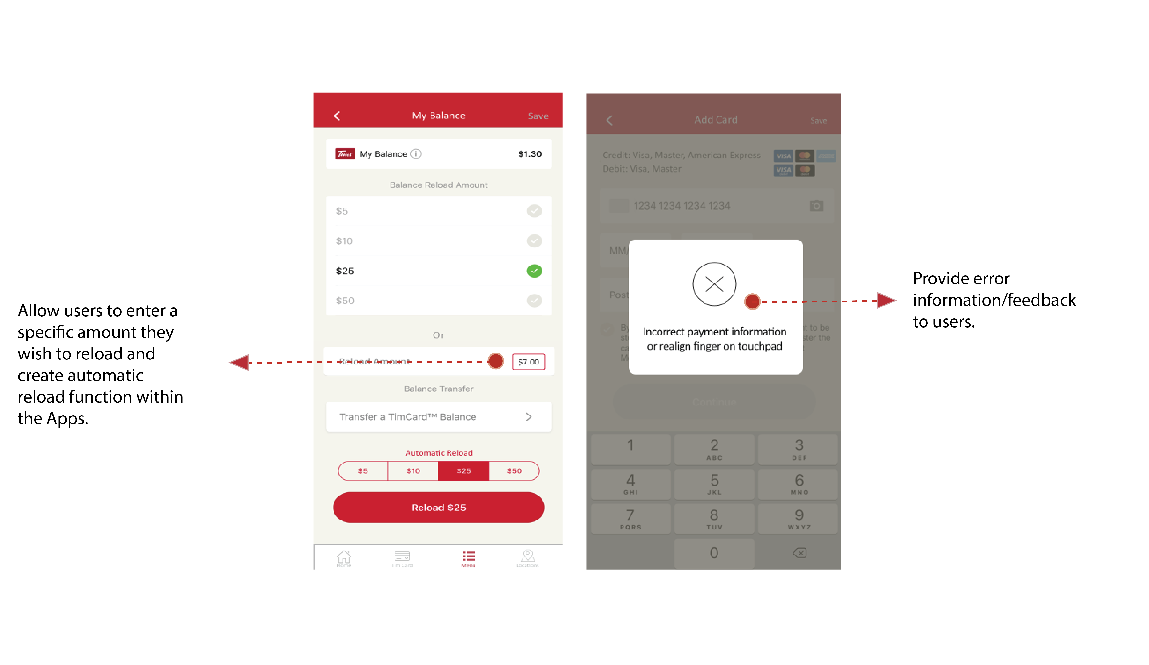
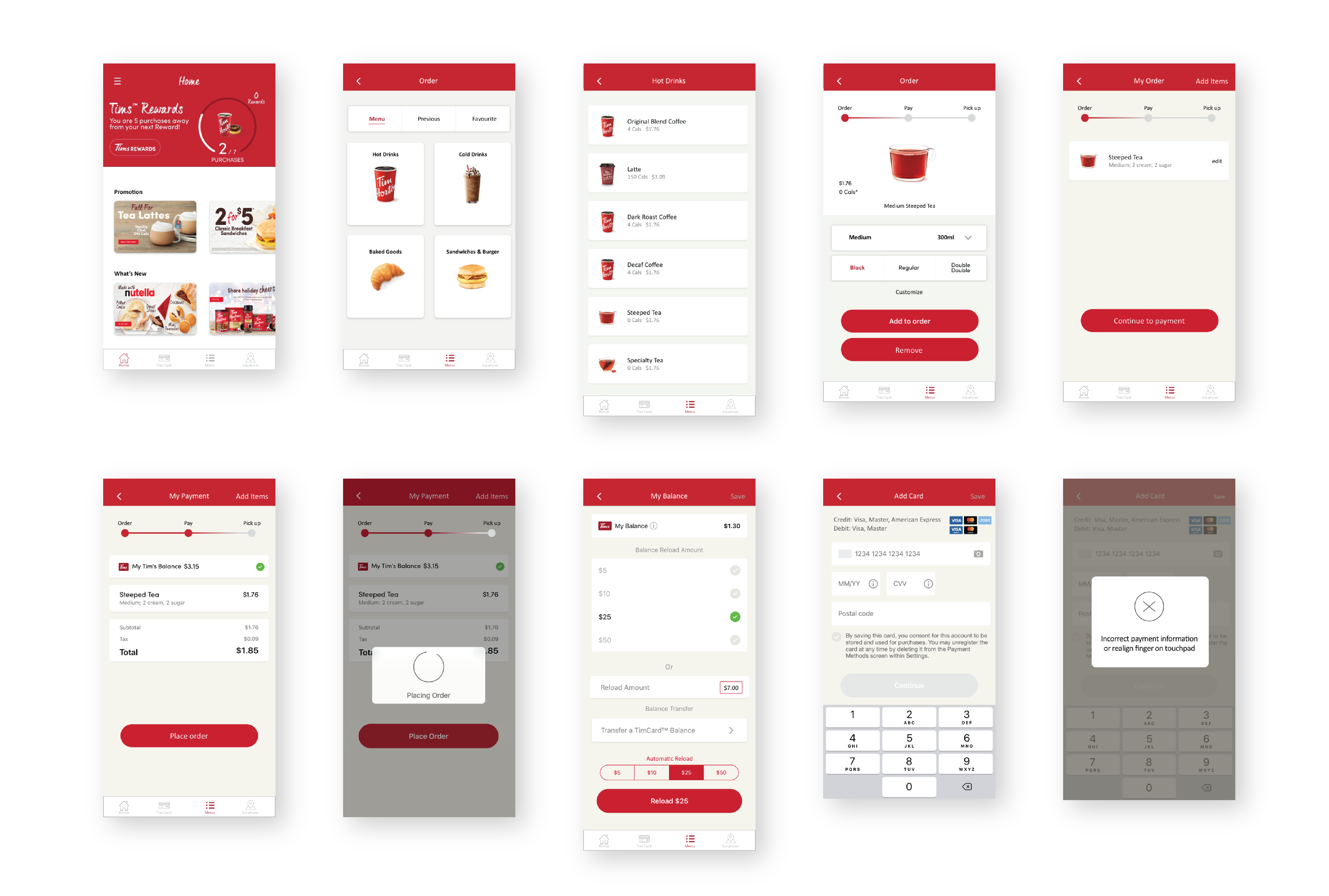
During the ideation process, we made sure to maintain the brand identity and the flow of the app. With the analysis and the heuristic evaluations, my teammate and I sketched some solutions, discussed them, and incorporated the strongest ideas into wireframes.

05. Wireframes

06. Redesign

Home Page 

Order Page

Reload and Payment  

Add Credit Card 

Overview of the Screen

07. Appendix: UI Library

Atomic Design Methodology

Understanding the basic elements of the Tim Hortons application was critical in informing our re-design as it served as a vital guide on how to maintain brand and visual consistency. Drawing inspiration from Brad Frost’s atomic design methodology, our redesign approach was to first break down all the elements into basic building blocks, then rebuilding our final product using those same pieces to create hierarchy and cohesion.


Bryan Li / Sr. UX Designer

Design must echo direction and purpose.

Copyright © Bryan Li All right reserved.