I designed a travel application that provides customized itinerary based on your needs.
I am the type of traveler with big dreams but no plan.
TIMELINE 8 Week Solo Project
MY ROLE Experience Strategy, Visual Design, Branding, Interaction Design
DELIVERABLES Persona, UX Research, Experience Maps, User Flow, UX Wireframe, Interactive Prototype, Visual Design, and Usability Testing
Why Tourguy?
I am the type of traveler with big dreams but no plan
I have spent many hours staring at my computer screen, trying to plan the perfect trip, hovering around the coffee machine, collecting pages and pages of information, and struggling to stay awake.
Or perhaps sifting through notepads and files, travel guides lying all around, feeling my pockets getting lighter from paying all my cellphone bills that rack up as I make calls to confirm bookings here and there. Not to mention the massive dent in my bank balance meant for my dream vacation. Yes, these are signs that humans are trying to paint the world with pens, diaries, and a bunch of advice from people involved in travel! Yes, it’s mine, a traveler with many dreams but no plans. In this case study, I would like to explain these questions when planning a trip. I would like to explain these questions when planning a trip.
Building the App – Design Process
Create User Interviews
In order to find an ideal solutions for the HMW question, I studied with three participants in a qualitative research approach. I used a qualitative study rather than a quantitative study because the qualitative data is more valuable in illustrating the pain points in this case , and how these pain points affect Millennials’ travel experience. By doing so, I developed two personas and one experience map as demonstrated in following sections.
Interviews are particularly useful for understanding the story behind a participant’s experience. As an interviewer, I can get a deep understanding of the subject. In order to achieve the most valuable results, the respondents chose the following basis/criteria:
1. Travelers does not speak the local language.
2. Travelers have travel style (e.g. economical, leisure, backpacker, etc.)
3. Travelers who have previous experience with trip planning.
“I wish there was a way I could have a customized itinerary online without worried and stressed.”
— Quote from interviewee
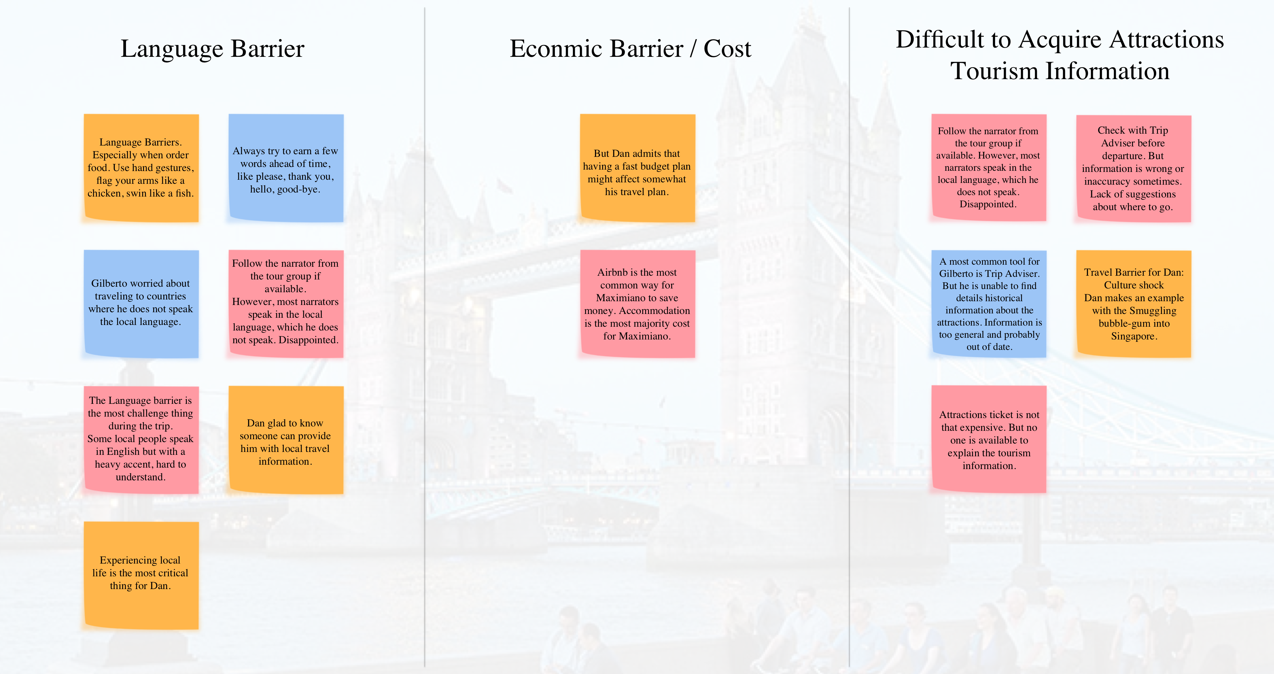
Data Points From Interview
Pain Point, Motivation, Behaviour
Themes From Categorizing Data Points
After the interview, I was able to sort their pain points into three major themes:
1. Language Barrier
2. Economic Barrier / Cost
3. Difficulty Accessing Tourism Information
Persona
Defining the Problem
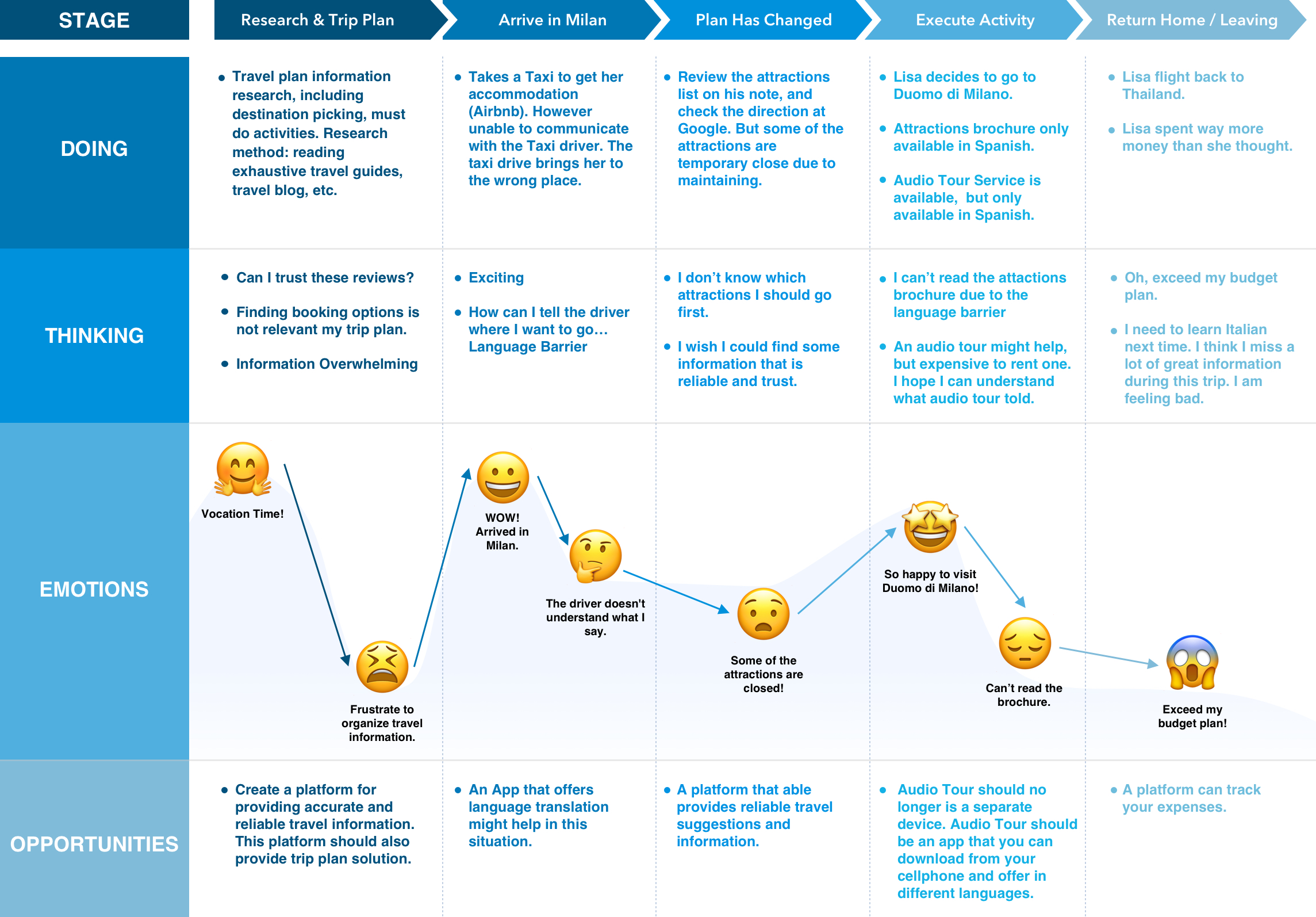
I created two personas to represent the target users: Lisa & Matt.
Consolidating the research & interviews, I created a narrative journey that centres around a traveler, Lisa, who plans to go to Toronto this November. The goal was to understand better this experience and the pain points/opportunities for design.
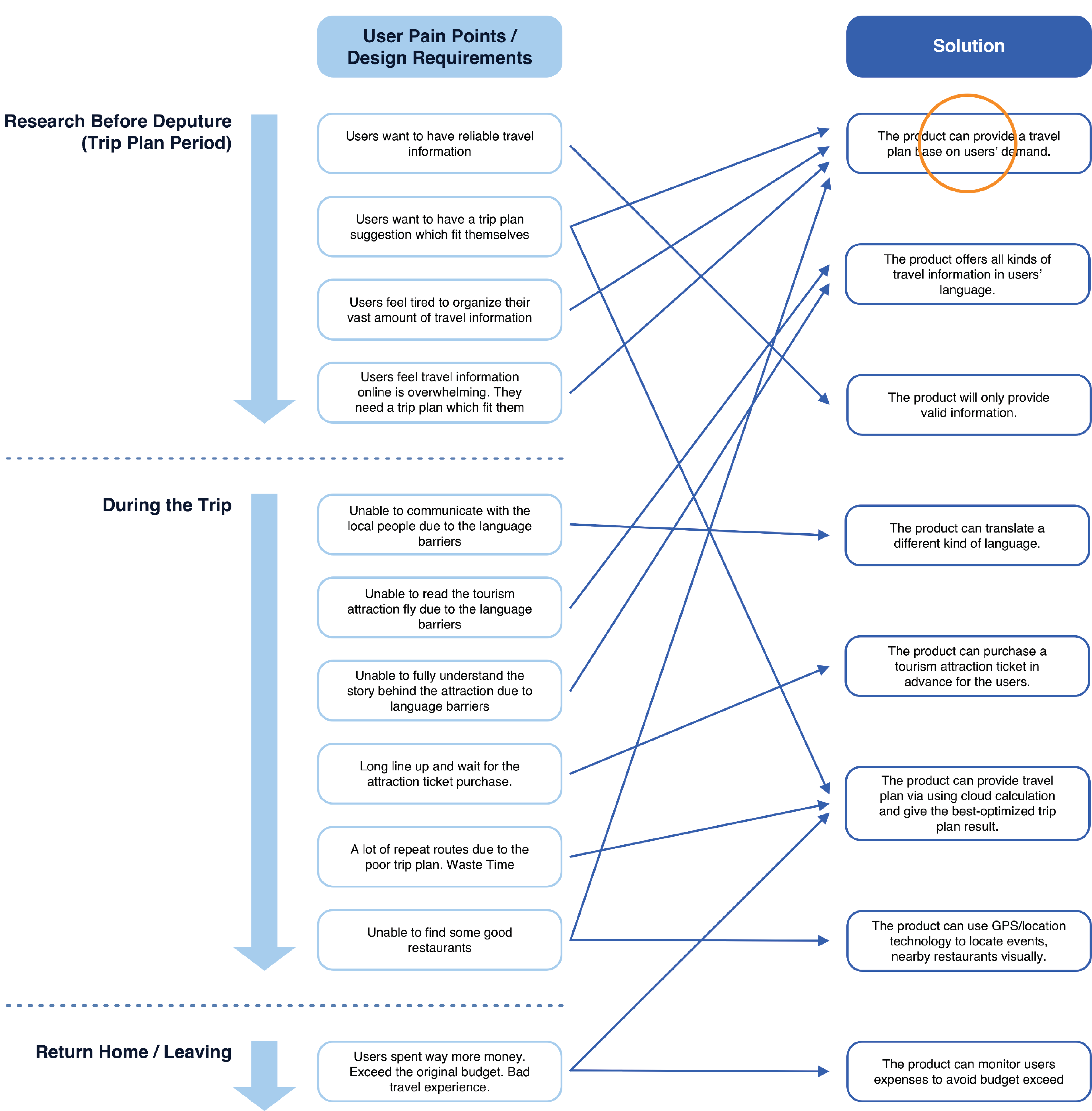
From research finding to design solution
I use a chart to list all the findings: “user” needs and market requirements, and brainstorming on the corresponding solutions. It allows me to organize research information without missing any valuable results. After that, I chose to provide users with optimized itinerary planning options as the main task solution for this case study. At the same time, I think this task process will be easier to resolve and fully covered because the entire project is limited to completion within eight weeks.
With all the insights I gathered I was able to come up with the question:
How might we provide travelers essential travel information for destinations around the world in a more convenient manner?
Ideation
A. User Epic & User Storey
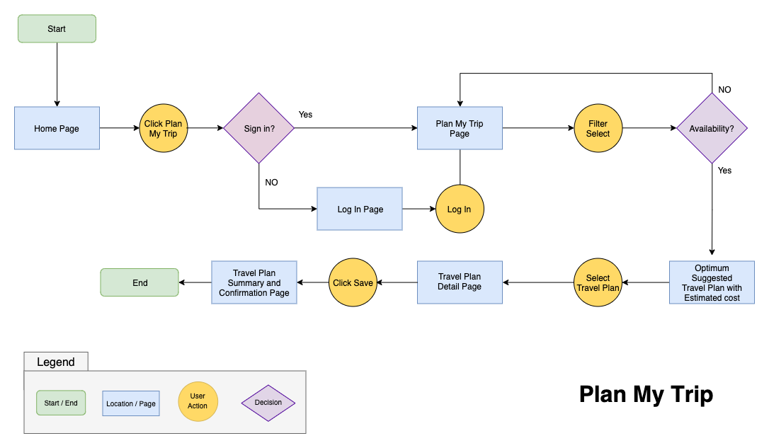
For my design solution, the key experience is the epic “Plan My Trip”. This is also the minimum viable feature the product can ship out if it will be developed within a short time.
There is one mobile application that has relevant approaches: Tripit.
It also targets tourists who need travel planning services. In addition, the current travel industry leaders in professional travel planning and booking are: and “Travelocity.” Although they are not our direct competitors, I seek to learn from their strengths and shortcomings for the purposes of my own application design. TripIt would be the most interesting to check out.
TripIt Pros
Easily keeping personal itinerary in one location to know your schedule.
Knowing co-worker schedules while they travel.
Having all confirmation numbers in one place.
Easy way for someone back in the office to help solve travel hiccups knowing my meeting schedules and other commitments.
Triplt Cons
The automatic import of scheduled hotel can occasionally miss a confirmation number depending on the source (small hotel or bed-and-breakfast example).
User interface hasn’t been updated in years.
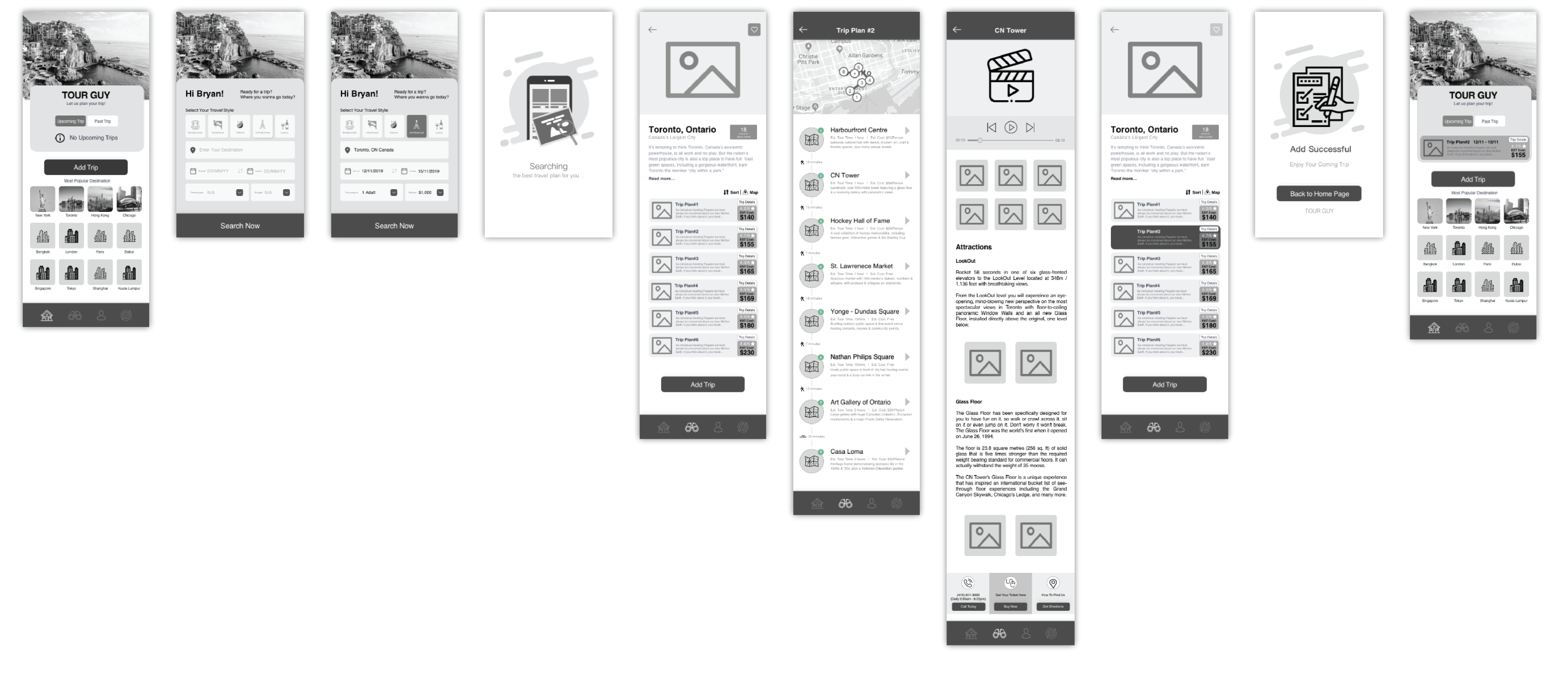
D. Sketches & Wireframes
Once I got an understanding of the users, their task and stories, I started sketching design solutions. The process of sketching enables me to visualize different ideas and try out content placement.
Concept Sketching
Crazy’8
Ideation
Initial Wireframes
Usability Testing
Usability testing isn’t a checklist item. It’s a design tool.
Key Insight Finding:
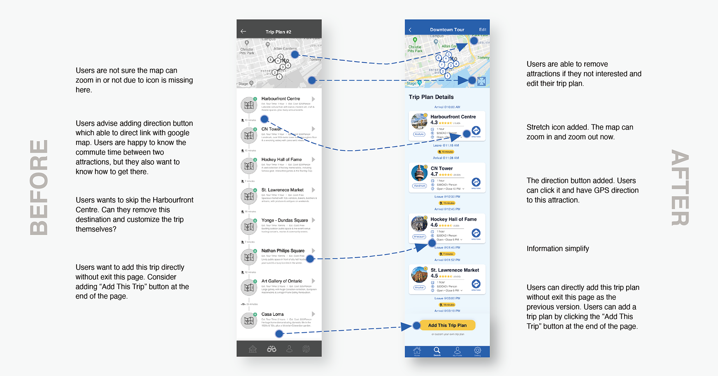
1. Users should able to remove not interested attractions
2. Information overwhelming
3. Users would like to explore the attractions’ review
Testing x1 x2 x3…
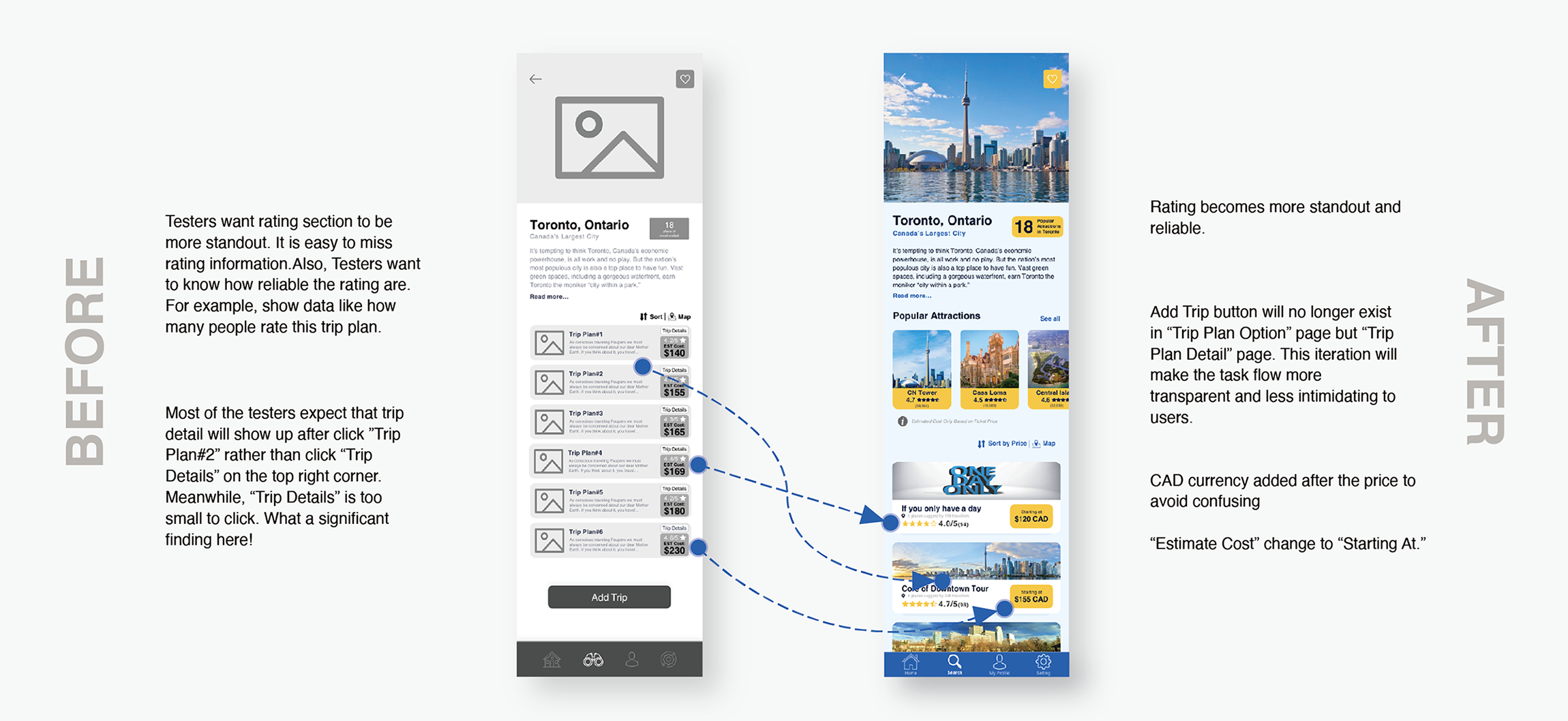
Following is some of the critical findings from conducting user testing and how I have made changes based on those insights. After changes were made, they were validated by testing more users.
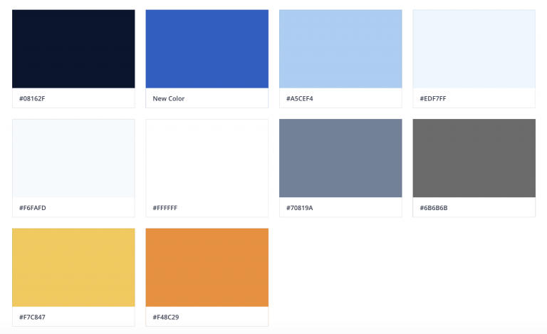
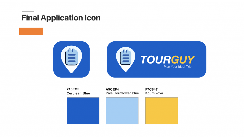
The mood and emotions to be evoked from the application are those of calm, nature, trust and overall wellness. As a visual designer, I can translate these feelings and emotions using colours, hues, and saturation. The brand emotional keywords are creative, relaxing, youthful, active, innovate, helpful, and professional.
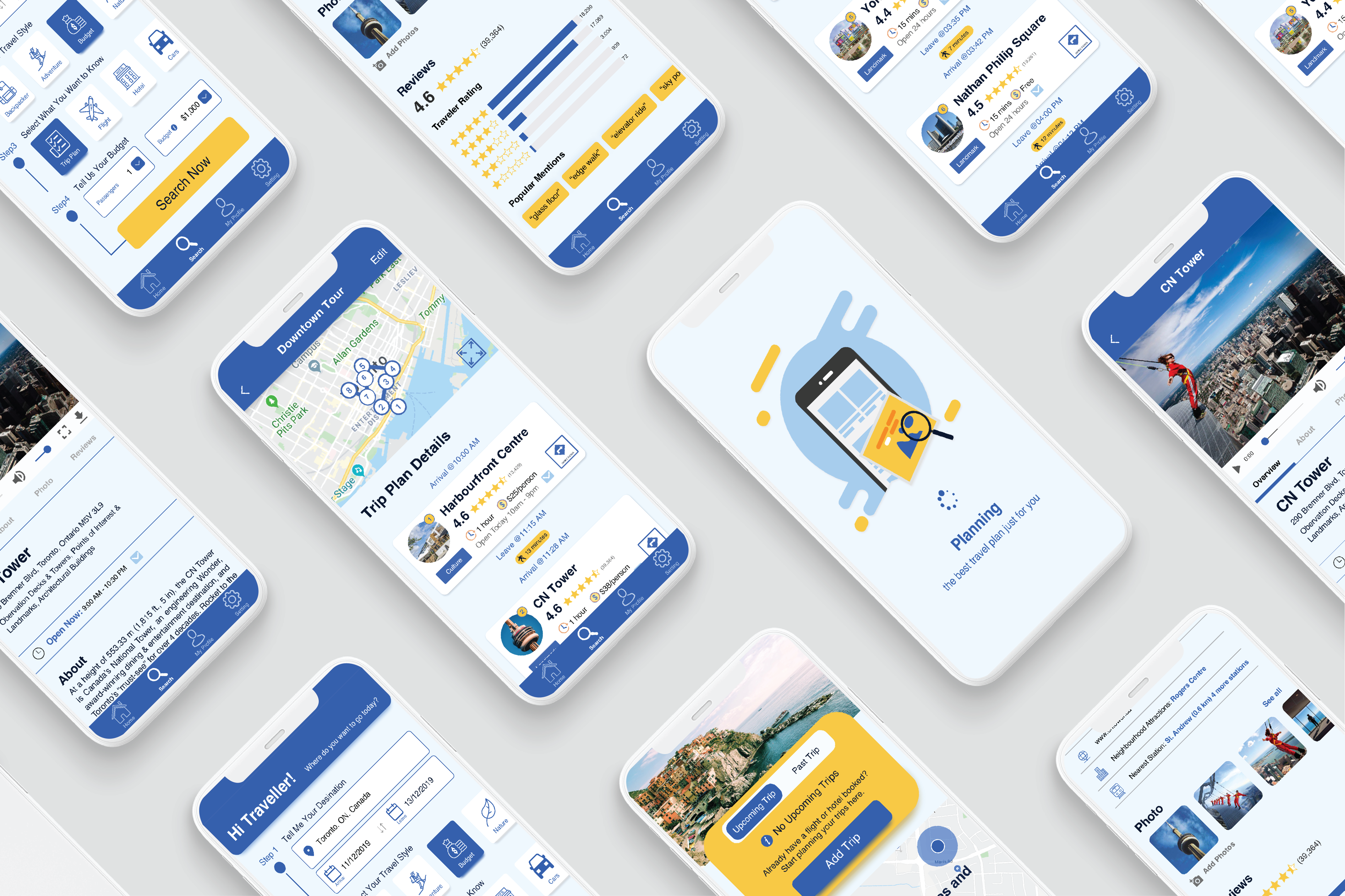
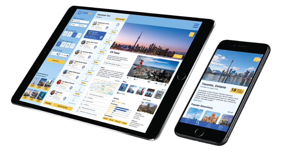
One main requirement our product had, was that it needed to function seamlessly on multiple devices (mobile, tablet, and computers). A key insight gained from our research as that travel planning were meant to be flexible. Travelers wanted to be able to open their planning application anytime anywhere, included on the flight with their phones and tablets, or at home with their computers.
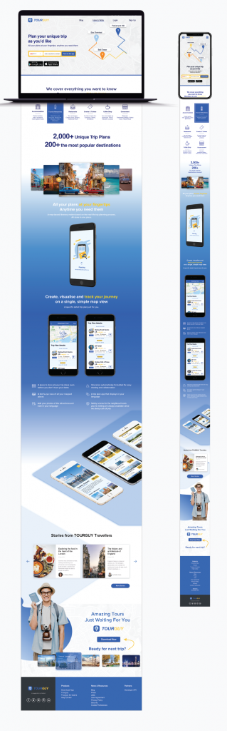
B. Marketing Site
Marketing landing page was designed to communicate the value proposition.
Next Steps
A. Audio Tour Feature
How to ensure attractions tourist information is provided in a fun and efficient way is also is the area to focus on in order to improve the travel experience. Audio tour feature would be a great potential feature to input to the app. Therefore, users would receive all of the tourist attraction information as they are walking through it.
B. Enhance the Sense of Domination
Future development will focus on how to make sure users have a feeling of total domination of the apps. What I want to make sure of is that users are using my apps to create their trip plan, rather than my apps telling them what to do or where to go. Users will have full control while using the apps, and this is also the aim of the human centre design.
Learning
A. Reflection
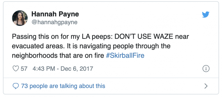
One of the main challenges of the Tourguy app is how to ensure that all travel information is always up-to-date and how to maintain a trusting relationship with users. Trusting relationships are not so easy to build but easy to break.
For example, the navigation app Waze led people to drive in the 2017 Southern California fires, thus putting their users in danger and causing a scandal. Keeping all travel information up-to-date is the top priority of the Tourguy app.
To keep all the tourism information up to date is the most priority to Tourguy app.
Focused on clarity, systems, and thoughtful digital experiences.